
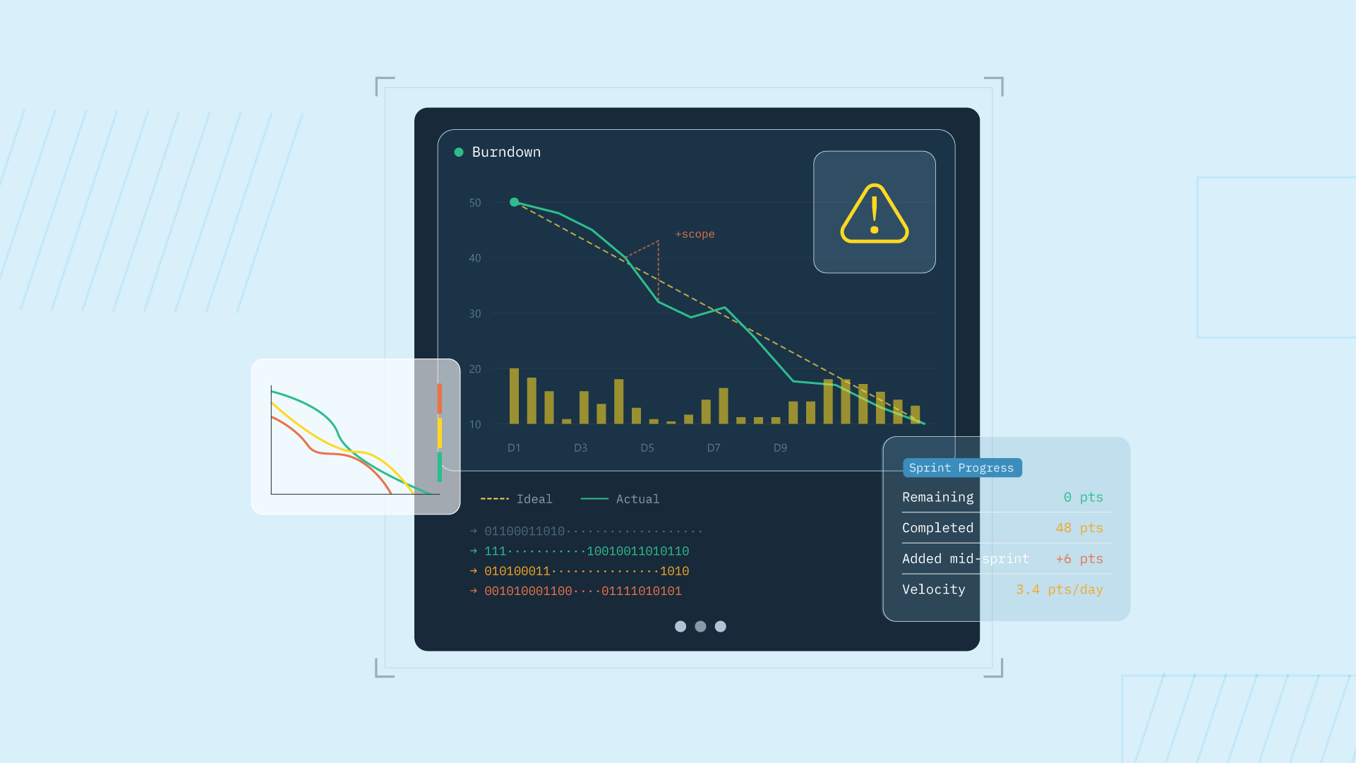
A burndown chart tracks work remaining against time, giving engineering teams a simple visual signal of whether they are on pace to finish a sprint or release. It plots an ideal downward slope against actual progress, and the gap between them tells the story. The chart is a fixture in Scrum and agile practice because it compresses a lot of information into a single glance, but like any metric, it works best when you understand what it shows and what it hides.
What is a burndown chart?
A burndown chart is a line graph that shows how much work remains in a given timebox. The vertical axis represents work remaining, usually in story points, hours, or task count. The horizontal axis represents time, typically days for a sprint or sprints for a release. An ideal line slopes evenly from the starting commitment to zero at the deadline. An actual line shows real progress, updated as work is completed or scope changes.
The chart answers one question directly: are we on pace to finish? Everything else is inference. A line above ideal means the team is behind. A line below ideal means ahead. A flat line means no work is closing. A sudden jump upward means scope was added. The value is in the conversation the chart provokes, not the line itself.
Types of burndown charts
Burndown charts come in two scales, and the distinction matters because each serves a different audience and decision.
Sprint burndown chart
A sprint burndown tracks one sprint, usually one to four weeks. The horizontal axis is days, the vertical axis is remaining work for that sprint. It is built for daily standup conversations and spotting mid-sprint slippage before it becomes a miss. In practice, the scrum master and the dev team own this chart. It lives on a dashboard or whiteboard and gets referenced in the daily scrum to decide if the sprint goal is still realistic or if the team needs to swarm on a blocked item.
Product burndown chart
A product burndown tracks the whole product or a major release across multiple sprints. The horizontal axis is sprints, the vertical axis is the product backlog. It is built for stakeholder and roadmap conversations, not daily standups. The product owner owns this view and uses it to answer questions about when a milestone will ship and whether the committed scope fits the timeline. It surfaces scope creep across sprints in a way a single sprint chart cannot.
Components of a burndown chart
Every burndown chart has four essential parts. Understanding each helps you read the chart correctly and know what decision it informs.
- Time axis (horizontal): The sprint days or sprint periods the chart covers. Sets the timebox for the commitment.
- Work axis (vertical): The remaining work, measured in story points, hours, or task count. Defines the size of the commitment.
- Ideal line: A straight slope from total commitment to zero at the deadline. Represents the even daily pace needed to finish on time.
- Actual line: The real progress, stepped down as work closes or jumping up as scope is added. Shows where the team actually stands.
How to read a burndown chart
Reading a burndown chart is simple once you know what the gap means. The actual line tells the real story against the ideal baseline.
When the actual line sits above the ideal line, the team is behind schedule. The vertical distance shows how much extra work remains compared to the plan. A small gap early in the sprint is normal. A widening gap late in the sprint signals a risk of not finishing.
When the actual line sits below the ideal line, the team is ahead of schedule. This sounds positive, but it can also mean estimates were padded or the sprint goal was too conservative. The chart does not explain why, only that less work remains than planned.
A flat actual line is the most important signal to watch. It means work is not closing. The cause could be blocked tickets, work in progress that is too large, or a team member out sick. Both shapes are conversation starters rather than conclusions. A flat line might mean three blocked tickets or one developer out sick, and the chart cannot tell you which.
Mid-sprint additions deserve a follow-up every time, not least because reactive work crowds out the roadmap, which is its own discipline to deal with unplanned work in software development.
Burndown chart example
Picture a two-week sprint where the team commits to 40 story points. On day one, the actual line starts at 40, right on top of the ideal line, which slopes evenly toward zero on day ten.
The first three days go well. The team closes a few small items, the actual line steps down to around 30, and it tracks slightly below ideal.
Then days four through six go flat. Two large tickets are in progress but nothing is finishing, so the line holds at 30 while the ideal line keeps falling. By day six the actual line sits clearly above ideal, and the team is behind.
The standup conversation catches it. One ticket is blocked on an external API, so the team swaps it for a smaller backlog item and splits the other ticket in two.
Days seven through nine show steep drops as the finished pieces land, and the sprint closes at 4 points remaining, slightly short but with no surprises.
That shape, early progress, a mid-sprint plateau, a correction, and a near-zero finish, is what most real burndowns look like.
Burndown chart vs burnup chart
A burnup chart is the same idea with opposite motion. Instead of plotting work remaining as it falls, it plots work completed as it rises, alongside a second line showing total scope.
| Burndown chart | Burnup chart | |
|---|---|---|
| Direction | Line falls toward zero | Line rises toward the scope line |
| What it plots | Work remaining | Work completed, plus total scope |
| Scope changes | Hidden inside the remaining-work line | Visible as movement in the scope line |
| Best for | Quick "are we on pace" reads during a sprint | Spotting scope creep and release tracking |
The practical difference is scope visibility. When scope is added mid-sprint, a burndown just shows the line jumping up, and the reader cannot tell added scope from slow progress.
A burnup separates the two, since the scope line moves independently of the completed line. If your sprints regularly absorb new work, the burnup is the more honest read.
Benefits and limitations of burndown charts
The burndown chart earns its popularity, and it has real blind spots. High-performing teams use it knowing both sides.
Benefits
- Simple. One glance answers "are we on pace," with no training required.
- Shared. Developers, managers, and stakeholders all read the same picture, which makes it a shared language for sprint progress.
- Fast to read. It fits in a standup without stealing the meeting.
- Surfaces trouble early. Plateaus and gaps show up days before the deadline does.
Limitations
- It hides scope changes. Added work and slow progress look identical on the remaining-work line.
- It depends on good estimates. If the committed points were wrong, the ideal line was fiction from day one, which is why improving your planning accuracy and tracking planning accuracy matter so much.
- It says nothing about value. A perfect burndown can describe a sprint spent building the wrong thing.
None of these limits make the chart bad. They make it one instrument, which is exactly how the best teams treat it.
Tracking delivery beyond the burndown with DevStats
A burndown answers "are we on pace this sprint," and that is the only question it answers.
Engineering leaders also need to know where work stalls, how much the team actually finishes, and whether delivery is stable, which takes issue cycle time, throughput, and DORA metrics alongside the sprint view.
Cycle time in particular tells you why the line went flat, the question the burndown raises and cannot answer. If you are new to the framework, our explainer on what the DORA metrics are is a good place to start.
DevStats is an engineering intelligence platform that puts that instrument panel around the burndown.
The sprints report shows live sprint progress next to scope changes and carryover, with cycle time and throughput trends one click away, all measured at the squad and process level rather than as individual scorecards.
The data stays diagnostic. DevStats shows you the sprint is slipping and where the work is stuck. You read it with your own knowledge of the team and decide the intervention.
See your sprint progress in real time
If your burndown lives in a spreadsheet someone updates after standup, you are reading yesterday's signal.
DevStats connects to the tools your team already uses and shows live sprint progress, scope changes, and delivery trends in one place, set up in under two minutes with no code changes. Start a free trial and see where this sprint really stands.
Frequently asked questions
What does a burndown chart show?
A burndown chart shows the amount of work remaining in a sprint or project plotted against time. The actual progress line is compared with an ideal line that falls evenly to zero, and the gap between them shows whether the team is ahead of or behind schedule.
What is the difference between a burndown and a burnup chart?
A burndown chart plots work remaining falling toward zero, while a burnup chart plots work completed rising toward a separate total-scope line. The burnup makes scope changes visible as movement in the scope line, which a burndown hides inside the remaining-work line.
Who uses a burndown chart?
Scrum masters and dev teams use sprint burndowns in daily standups to track sprint progress, while product owners use product burndowns to track a release across sprints for stakeholders. Engineering managers and VPs read both to keep delivery conversations grounded in shared data.
What are the limitations of a burndown chart?
A burndown chart hides scope changes, depends on the accuracy of the original estimates, and says nothing about whether the team is building the right thing. It is best treated as one diagnostic instrument alongside metrics like cycle time and throughput rather than a complete picture of delivery health.