
The 2025 Stack Overflow report showed that only one in four developers is happy in their current role. The top reasons? Lack of autonomy and low real-world impact.
Not a skills gap. Broken systems.
When the CEO asks "why are we only shipping two features this quarter with 20 developers?", you need numbers. Developer productivity metrics give you those numbers, if you measure the right things and know how to read the data without turning your engineering org into a surveillance operation.
This guide covers which metrics actually change decisions, how the SPACE and DORA models work together, and how to turn raw data into action your team respects and your board understands.
Key takeaways
-
Developer productivity metrics work best when they measure processes and systems rather than individual output, and the strongest teams combine delivery speed data (DORA) with wellbeing, collaboration, and flow signals (SPACE) to build a complete picture of engineering health.
-
Lines of code, commit counts, and story points completed tell you almost nothing useful about whether your team is shipping the right things at a sustainable pace; cycle time, deployment frequency, PR pickup time, and engineering allocation are where the real diagnostic power lives.
-
The biggest risk with developer productivity tools is treating them as performance scorecards instead of diagnostic instruments; engineering leaders who use metrics as coaching data retain more developers and ship faster than those who use metrics to rank and stack.
-
DevStats connects to your existing tools (GitHub, Jira, Linear, and 20+ others), benchmarks your team against 1,000+ engineering orgs, and surfaces DORA, SPACE-aligned, and AI impact metrics in under 2 minutes with no code changes. Start a free trial to see where your engineering time actually goes.
Why developer productivity metrics go wrong
Counting lines of code as a productivity signal is like measuring a surgeon's skill by the length of the incision. More is not better.
The same applies to commit frequency, ticket velocity, and story points completed. These vanity metrics are easy to collect, easy to game, and almost useless for answering the question that matters: is your team focused on the right work, at a sustainable pace, with acceptable quality?
McKinsey's 2023 article on measuring developer productivity drew heavy criticism from Kent Beck (the creator of Extreme Programming) and others precisely because it leaned on output-centric metrics. The backlash was predictable.
Developers have seen this pattern before: a new measurement system gets introduced, people start gaming it, and the org ends up with less clarity than when it started.
Here's what goes wrong:
-
The team optimizes for the metric, not the outcome. Story point inflation is a real phenomenon. When velocity becomes a target, estimates quietly creep upward until the dashboard looks great and nothing has actually changed.
-
Individual output metrics punish the wrong people. The senior engineer who spends three days mentoring a junior, reviewing architecture decisions, and unblocking two squads writes zero code that week. Output metrics would flag them as unproductive. They multiplied the team's impact.
-
Speed without quality creates a debt spiral. A team shipping fast with a 30% change failure rate is borrowing against its own future. Every broken deploy creates more unplanned work, which slows the next sprint.
The fix is to measure the system, not the individuals. That means using a model designed for how software teams actually work.
The SPACE model explained for engineering leaders
Nicole Forsgren, Margaret-Anne Storey, and their colleagues at GitHub and Microsoft Research published the SPACE model in 2021. The problem it addressed was straightforward: single-dimensional metrics distort your understanding of productivity.
SPACE breaks developer productivity into five connected dimensions:
| Dimension | What it measures | Example metrics |
|---|---|---|
| Satisfaction & wellbeing | How fulfilled and healthy developers feel | Satisfaction surveys, burnout indicators, retention rates |
| Performance | Outcomes and quality of work produced | Code review quality, customer-reported defects, feature adoption |
| Activity | Volume and type of actions performed | PR count, commit frequency, code review participation (use with caution) |
| Communication & collaboration | How well teams share knowledge and coordinate | Review turnaround time, onboarding speed, knowledge distribution |
| Efficiency & flow | How smoothly work moves through the system | Cycle time, uninterrupted focus time, handoff count |
The model's core rule: never rely on metrics from fewer than three of these dimensions.
A team that looks fast (high Activity) but burned out (low Satisfaction) and shipping bugs (low Performance) has a retention and quality crisis brewing under the surface. Single-dimension metrics would completely miss it.
For engineering leaders at growth-stage SaaS companies, SPACE is particularly useful because it translates technical performance into terms non-technical stakeholders can act on. When the board asks about engineering ROI, you can point to a balanced set of signals instead of cherry-picking one number.
The developer productivity metrics that change decisions
Not all metrics deserve a spot on your dashboard. The ones below have earned their place because they tell you where work stalls, where quality drops, and where your team's time actually goes.
Delivery speed metrics
Cycle time measures how long it takes from a developer starting work to that work running in production. It captures the full journey, including reviews and deployment.
A team with a 2-day cycle time ships ten times more feedback loops per month than a team with a 20-day cycle time.
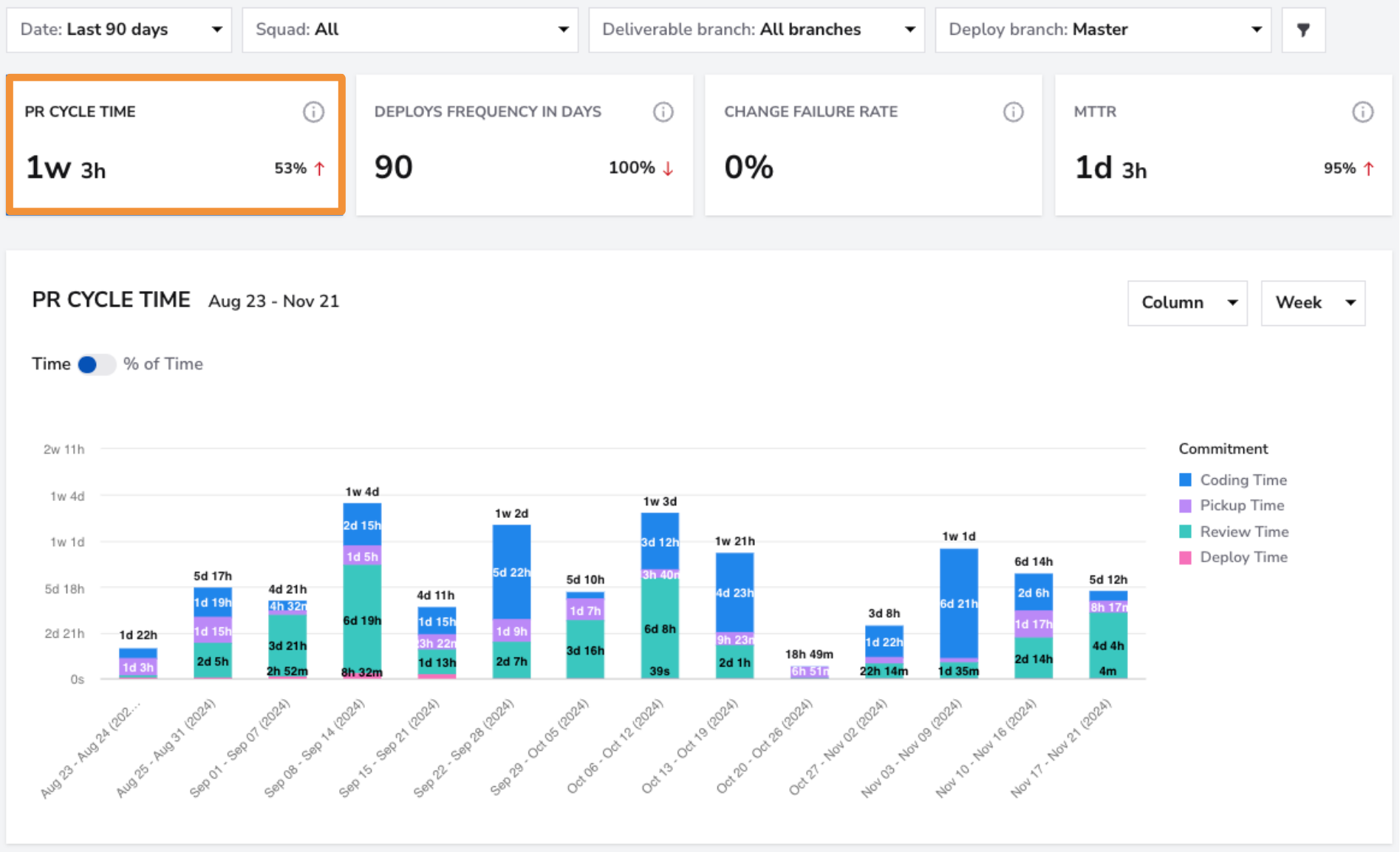
PR cycle time breaks every pull request into five stages: Coding, Pickup, Review, Merge, and Deploy. This granularity changes what you can diagnose.
If your cycle time is 8 days but 5 of those days are pickup time (the gap between opening a PR and someone reviewing it), the bottleneck is review distribution, not coding speed.
Deployment frequency tracks how often your team pushes changes to production. Google's DORA research found that elite-performing teams deploy on demand (multiple times per day), while low performers deploy less than once every six months.
Quality metrics
Change failure rate is the percentage of deployments that cause a production failure. The DORA benchmarks classify elite teams between 0% and 15%. If you're above 30%, your testing and review processes need attention before you push for more speed.
Rework rate measures how much code gets rewritten shortly after it was merged. High rework usually signals unclear requirements, weak code review practices, or developers rushing to close tickets without proper design time.
Flow and efficiency metrics
Work in progress (WIP) counts how many items a developer or squad is working on simultaneously. If three developers on your team each have 6+ items in progress, you have a focus problem.
Lead time for changes captures the full duration from when a change is requested to when it reaches production. It includes cycle time but adds the planning and queue time before a developer picks up the work.
A large gap between lead time and cycle time tells you that work is sitting in backlogs too long.
PR pickup time measures how long a pull request waits before someone starts reviewing it. Teams that keep pickup time under 4 hours consistently ship faster across their entire pipeline.
Team health metrics
Engineering allocation categorizes where your team's time goes across four buckets: new features, improvements, maintenance, and tech debt work.
This is the metric that answers the CEO's question. If 60% of your engineering effort goes to bug fixes and maintenance, it explains why the roadmap feels stuck. It also gives you the data to argue for a focused tech debt sprint.
Developer satisfaction requires surveys. You cannot capture it from a Git integration.
But ignoring it is expensive. The LeadDev Engineering Leadership Report 2025 found that 22% of engineering leaders and developers face critical burnout levels, with another 24% at moderate levels. If you're only measuring deployment frequency while your senior engineers are polishing their resumes, the dashboards will not save you.
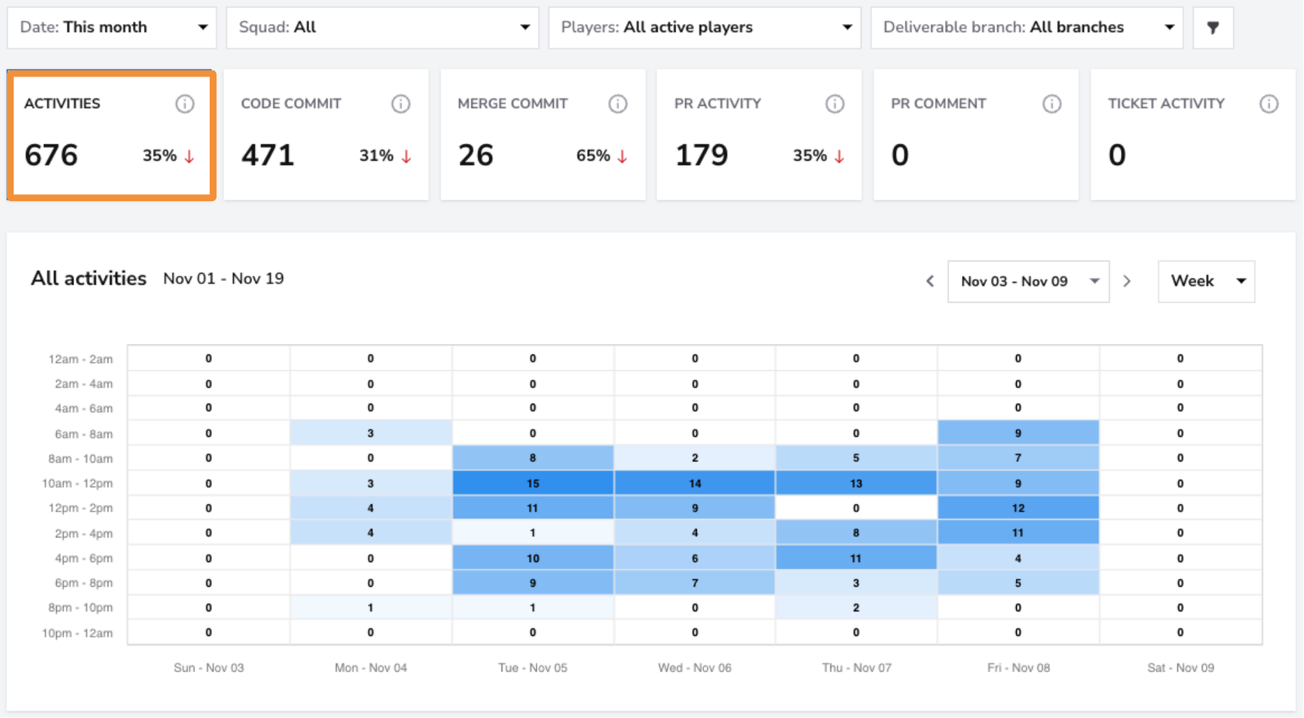
DevStats allocation reports split your team's time into these four buckets automatically, and pair them with activity heatmaps that flag unsustainable work patterns. Teams using them see up to 75% more time on roadmap work by reducing reactive tasks.
DORA metrics as your delivery baseline
The DORA (DevOps Research and Assessment) program, now part of Google Cloud, has surveyed over 33,000 professionals across multiple years to identify what separates high-performing engineering teams from the rest.
The research distilled delivery performance into four metrics:
| DORA metric | What it measures | Elite benchmark |
|---|---|---|
| Deployment frequency | How often code reaches production | On demand (multiple deploys per day) |
| Lead time for changes | Time from commit to production | Less than one day |
| Change failure rate | % of deploys causing a production failure | 0–15% |
| Time to restore service | How fast you recover from failures | Less than one hour |
These four metrics work as a system. Optimizing any one in isolation creates problems.
Pushing deployment frequency without watching change failure rate produces the "ship fast, break everything" antipattern. Reducing change failure rate by adding heavyweight approval gates will tank your lead time.
Use DORA as a baseline health check. Where does your team land compared to elite, high, medium, and low performers? Once you have that baseline, DORA tells you what to fix. SPACE tells you why it's broken and whether the fix is sustainable.
DevStats calculates all four DORA metrics automatically and benchmarks your results against 1,000+ engineering teams, so you get your performance tier without building spreadsheets.
How to read developer productivity data without wrecking your culture
This is where measurement programs fall apart. The collection is the easy part. Interpretation is where leaders make or break their teams' trust.
A metric on a dashboard is not a diagnosis. It's a blood test result. You still need someone with organizational context to decide what it means and what to do about it.
Step 1: Look for patterns, not snapshots. A single sprint with high cycle time means nothing. Three consecutive sprints with increasing cycle time means your process is drifting.
Step 2: Pair speed metrics with quality metrics. If cycle time drops but change failure rate rises, your team sped up by cutting corners. That's borrowing from the future.
Step 3: Check team health before pushing harder. If after-hours activity is climbing while throughput stays flat, your team is working harder for the same output. That signals process friction, tech debt, or unclear priorities.
Step 4: Contextualize every anomaly. A high change failure rate might look alarming in isolation. But if the CEO said "move fast and break things" during a product launch sprint, the elevated rate might be a deliberate trade-off.
Like a doctor seeing elevated heart rate in an athlete mid-race, context changes the interpretation.
Step 5: Share the data with your team, not just leadership. Metrics used as a coaching tool build trust. Metrics used for surveillance destroy it. When engineers can see their own squad's cycle time breakdown and throughput trends, they become partners in improving the process.
Measuring AI coding tool ROI
Your company rolled out GitHub Copilot or Cursor three months ago. Leadership wants to know: is it worth the money?
This question is becoming one of the top reasons engineering leaders start looking for a metrics platform. And teams rarely have the data to answer it.
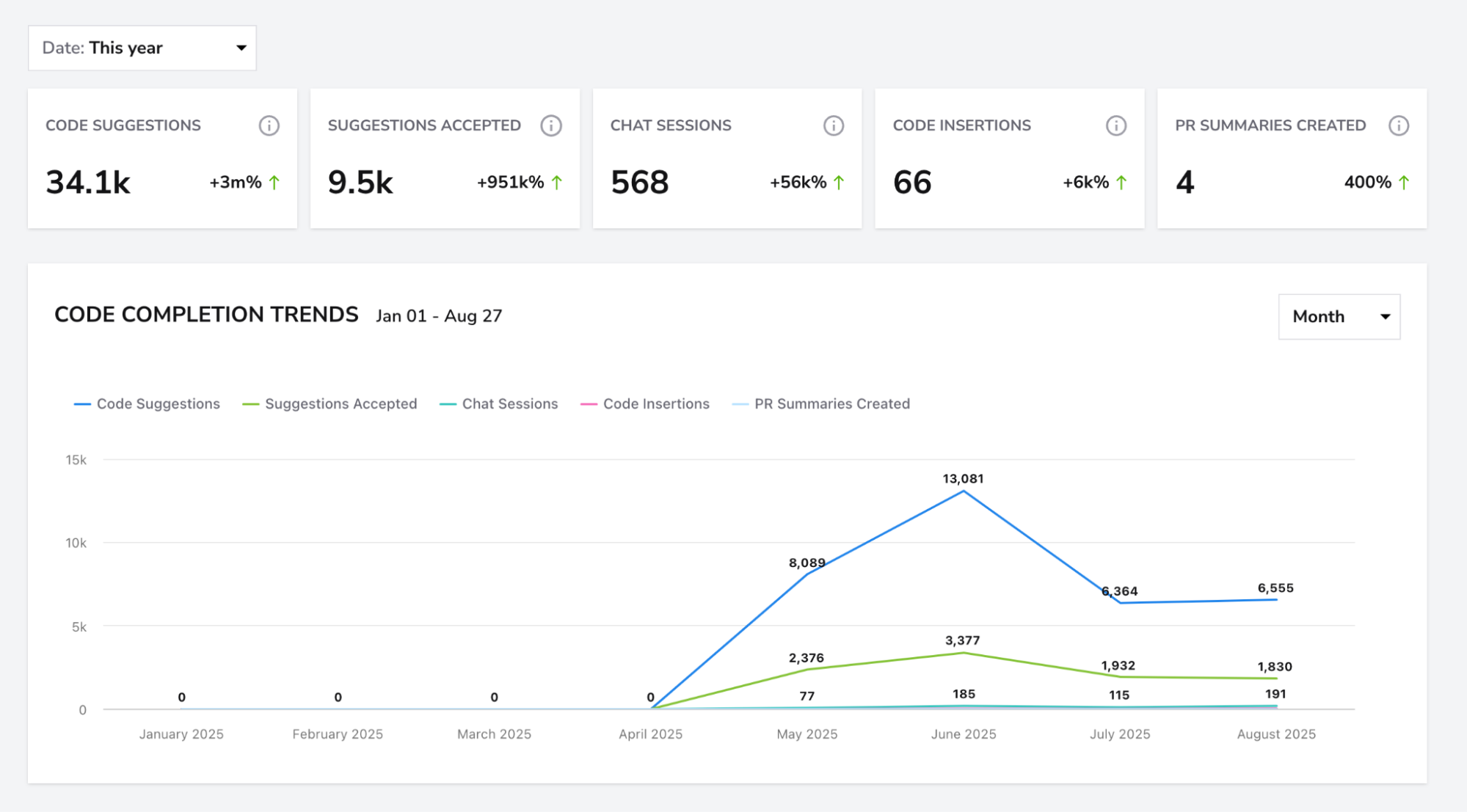
AI impact tracking measures the percentage of AI-assisted PRs, velocity changes, quality score shifts, and review time effects. Without this data, AI tool adoption is an act of faith.
Three questions to answer with AI impact data:
-
Are developers actually using the tools? Adoption rates vary by team. Some go all-in; others ignore them entirely. Knowing adoption by the team lets you target training where it matters.
-
Is AI-assisted code faster to ship? Compare cycle time and throughput for AI-assisted PRs versus non-assisted ones across the same time period.
-
Is AI-assisted code as reliable? If AI-assisted PRs show higher rework rates or change failure rates, the speed gain might be an illusion. You need both sides of the equation.
Reports of companies pausing AI tool access for mid-level developers without senior review point to a real concern: faster code generation without quality assurance creates new risks. Developer productivity metrics that include AI impact data let you manage this tension with evidence instead of blanket policies.
DevStats tracks AI-assisted PRs across GitHub Copilot, Cursor, Claude Code, Amazon Q, Cody, and Windsurf, with velocity and quality comparisons side by side. Teams see up to +24% velocity impact on AI-assisted PRs.
From data to decisions
Metrics are only useful if they change behavior. Here's a step-by-step process for improving developer productivity with the data you've collected:
-
Establish your baseline. Connect your Git repos and issue tracker to a metrics platform. Get your DORA tier. Know your current cycle time, deployment frequency, and allocation split.
-
Pick one bottleneck. If your PR cycle time report shows that review pickup is the biggest time sink, start there. Set a target: pickup time under 4 hours within 30 days.
-
Run a time-boxed experiment. Rotate reviewer assignments, set Slack alerts for open PRs over 4 hours, or break down PR sizes to under 300 lines. Run it for two sprints.
-
Measure the result. Did pickup time drop? Did it create new problems, like reviewer fatigue or lower review quality? Check multiple SPACE dimensions.
-
Repeat or pivot. If it worked, document the change and move to the next bottleneck. If it didn't, diagnose why and try a different intervention.
The engineering leader decides what the data means and which interventions to run. The metrics platform gives you the diagnostic; your organizational context determines the treatment.
That cycle, repeated quarterly, is how teams achieve up to 59% faster cycle times and up to 30% faster shipping speeds through a series of small, data-backed experiments.
Get your team's baseline with DevStats
Everything in this guide, DORA benchmarks, 5-stage PR cycle time breakdowns, engineering allocation, AI impact tracking, activity heatmaps, is what DevStats surfaces out of the box.
It connects to GitHub, GitLab, Jira, Linear, PagerDuty, and 20+ other tools your team already uses. Setup is self-serve, takes under 2 minutes, requires no code changes, and pulls up to 3 years of historical data on day one.
Every dashboard measures squads and workflows, with no individual rankings or stack-ranking features. SOC 2 Type II compliant.
Pricing starts at $15/month per contributor (Starter) and $27/month per contributor (Pro, which includes a dedicated Slack channel). Enterprise pricing is custom.
A 14-day free trial gets you real data the same afternoon you sign up. If your team is over 50 developers or you want a walkthrough first, contact us.
Frequently asked questions
What are the best developer productivity metrics to track first?
Start with cycle time, deployment frequency, and change failure rate. These three DORA-aligned metrics give you a delivery speed and quality baseline without requiring surveys or subjective inputs. Once you have that foundation, add engineering allocation data to show leadership where time goes, and PR cycle time to find bottlenecks in your review process.
How do you measure developer productivity without micromanaging?
Focus on team-level process metrics instead of individual output metrics. Measure cycle time for the squad, not commits per developer. Track PR pickup time across the team, not how many hours each person spends coding. Share the data openly so engineers see the same dashboards as leadership. When developers understand that metrics exist to remove friction from their workflow, they become partners in improving the process. The SPACE model is built on this principle: non-toxic metrics that measure processes, not people.
What is the SPACE model for developer productivity?
SPACE stands for Satisfaction & wellbeing, Performance, Activity, Communication & collaboration, and Efficiency & flow. Researchers from GitHub, Microsoft Research, and the University of Victoria developed it in 2021 to address how single-metric approaches distort productivity understanding. The core rule is to measure across at least three SPACE dimensions at once so you catch problems that any one metric would miss.
How do DORA metrics and SPACE work together?
DORA gives you four specific delivery performance metrics (deployment frequency, lead time for changes, change failure rate, time to restore service) that benchmark your team against industry standards. SPACE tells you why your DORA numbers look the way they do and whether your delivery speed is sustainable. Think of DORA as the signal ("we're slow") and SPACE as the diagnostic ("we're slow because of review bottlenecks, WIP overload, and declining developer satisfaction").