
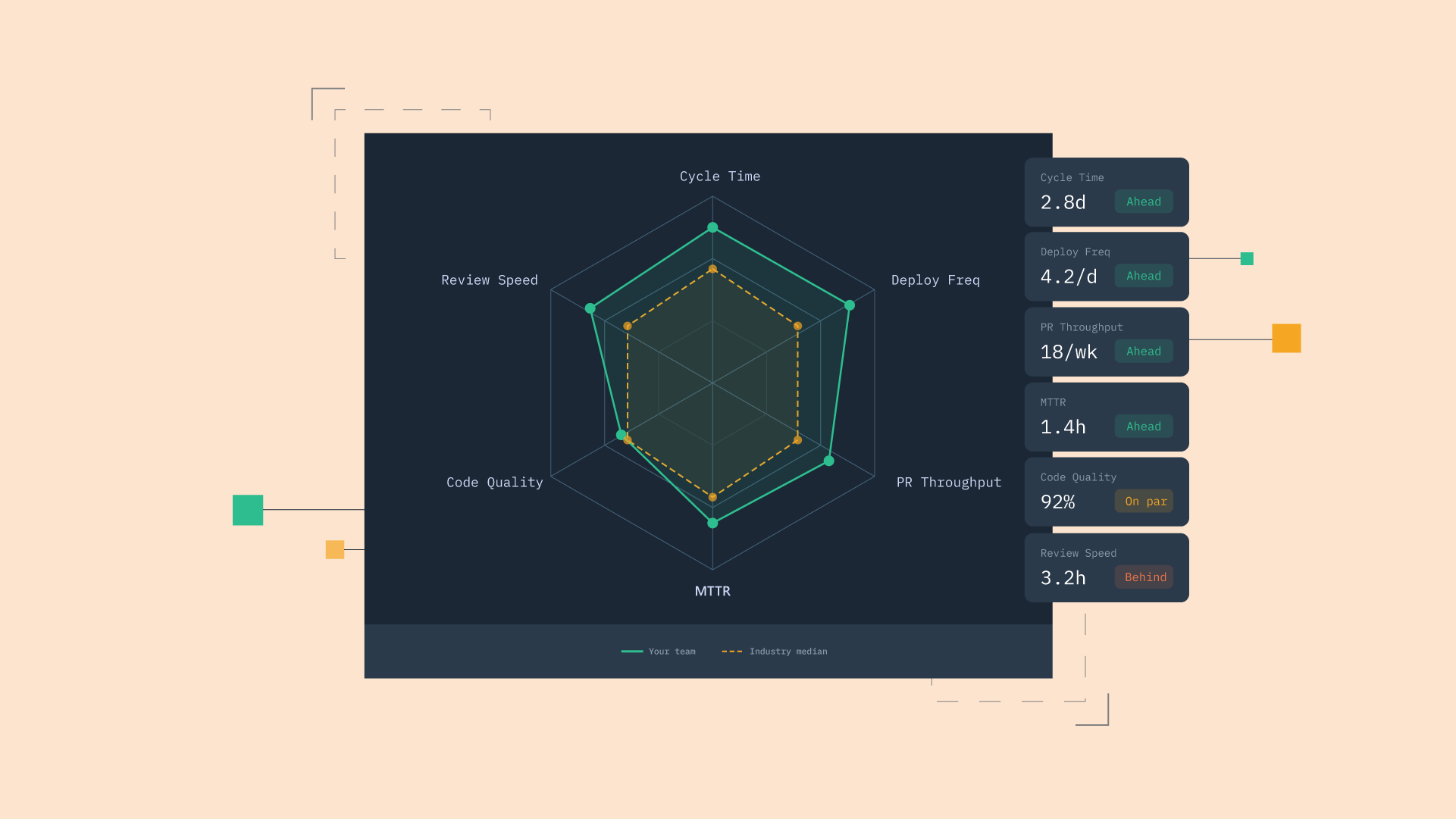
You can track every engineering metric there is and still not know the one thing your board is asking: are we good?
A dashboard full of green numbers means nothing without a reference point, and "better than last quarter" only goes so far when you have no idea what better looks like for a team your size.
That is the gap to close. Most pieces on software engineering performance metrics list the numbers and stop, leaving you to guess whether your cycle time is healthy or embarrassing. Here are the metrics worth tracking, then the harder job: the benchmark bands, what Elite through Low actually look like, and how to read peer data without lying to yourself about where your team stands.
Engineering performance metrics: key takeaways
- Engineering performance metrics cover speed, quality, flow, investment, and team health, and no single category answers whether a team is performing well.
- KPIs are the small subset of metrics a team has committed to acting on, so calling everything a KPI is why dashboards fill with numbers nobody uses.
- Benchmark bands are calibration, not a verdict, and the right target for most teams is the next band up, never Elite by default.
- Team size and industry change what good looks like, so honest benchmarking compares you to peers of similar size in your sector rather than to a universal ideal.
- See how your team compares to 1,000+ similar-size teams in your industry. Start a free trial and connect your tools in under two minutes.
What are engineering performance metrics?
Engineering performance metrics are the quantitative signals leaders use to understand how a team is delivering, spanning speed, quality, flow, team health, and investment. They turn a vague sense of "things feel slow" into something you can actually point at, compare over time, and act on.
The catch is that these metrics only become useful when you know what the numbers should be. A 30-hour cycle time is meaningless in isolation; it is good or bad only relative to your own past and to comparable teams. That is why two jobs follow here: naming the metrics worth tracking, and answering the question readers actually came for, which is how to read benchmark data without fooling yourself.
A quick note on language before the metrics. The terms metric, KPI, and benchmark get used interchangeably and they are not the same thing, so the next section pins down the difference that makes the rest of it work.
Engineering KPIs vs engineering metrics: what's the difference?
A metric describes what is happening across the system. An engineering KPI is the small subset of metrics a team has committed to using for decisions. Every KPI is a metric; almost no metric deserves to be a KPI.
Most teams call every metric a KPI, which is exactly why dashboards drown in numbers nobody acts on. When deployment frequency, commit count, story point accuracy, and a dozen others all wear the "key" label, none of them actually drives a decision, and the team learns to skim past the whole screen.
The test is simple. A number is a KPI only if its movement would change what the team does next, and most numbers fail that test. Picking the handful that pass is the difference between a dashboard that informs and one that decorates.
The frameworks behind engineering performance metrics
Before the metrics themselves, it helps to know the frameworks you will see referenced everywhere. Each one defines a different slice of performance, and knowing what each measures makes it easier to pick.
DORA
DORA is built on four metrics: deployment frequency, lead time for changes, change failure rate, and time to restore service. It came out of Google's State of DevOps research and the book Accelerate by Forsgren, Humble, and Kim. DORA is now the de facto standard for measuring delivery system performance. It is the best starting point because the metrics are concrete and the benchmark bands are public, which makes it the natural framework for comparing against industry. For a deeper look, see what the DORA metrics are.
SPACE
SPACE covers five dimensions: satisfaction and well-being, performance, activity, communication and collaboration, and efficiency and flow. The framework was designed by Forsgren et al. to pull teams away from output-only measurement and toward team health. It is best for surfacing what DORA alone misses, like developer friction, deep work, and how people actually feel about the work.
DevEx and DX Core 4
DevEx frameworks focus on the friction that slows engineers down day to day. DX Core 4 folds DORA, SPACE, and DevEx into four dimensions of speed, effectiveness, quality, and business impact. It suits teams that want a single unified scorecard rather than a layered set of separate models.
Which framework should your team use?
Most mid-market teams should start with DORA, because the metrics are concrete and the bands are public, then layer SPACE or DevEx surveys once the delivery system is stable.
The frameworks are tools, not commitments, and you can borrow from several without adopting any one wholesale. Picking a framework matters far less than actually using it, since the worst framework consistently applied beats the best one that lives in a slide deck.
The core engineering performance metrics worth tracking
The most useful engineering team performance metrics group into five categories rather than one flat list. Thinking in categories keeps a dashboard balanced, since over-indexing on speed while ignoring quality is how teams ship faster and break more. These categories also carry through into the benchmark chapter, where they become the basis for comparison. For a broader tour of the field, our overview of software development metrics covers the wider set.
Speed metrics: deployment frequency, lead time, cycle time
Speed metrics show how fast work moves from idea to production. Deployment frequency is how often you ship, lead time for changes is the time from commit to deploy, and cycle time is the span from the start of work to deploy.
Aggregate cycle time hides where work actually stalls, which is the case for breaking it into stages. A staged view of PR cycle time shows whether the delay lives in coding, pickup, review, or merge, and we make the deeper argument in why cycle time is the most important metric. Lead time and cycle time also get conflated constantly, so it is worth being clear on lead time versus cycle time.
Quality metrics: change failure rate, MTTR, rework rate
Quality metrics show whether speed is coming at the cost of stability.
- Change failure rate: the percentage of deployments that cause incidents.
- Mean time to recovery: how fast you fix breaks.
- Rework rate: how much code gets rewritten shortly after merge.
The pair to watch is speed against quality. An improvement in one without the other usually means something is being traded away, so a rising deployment frequency next to a rising change failure rate is not progress, it is faster breakage.
Flow metrics: throughput, code review balance, WIP
Flow metrics show how work is distributed and where it stacks up.
- Throughput: PRs merged or issues closed per week.
- Code review balance: how reviewer load is spread across the team.
- Work in progress (WIP): how many items each developer is carrying at once.
These are leading indicators. Flow metrics shift before speed and quality metrics do, so a widening review queue or climbing WIP gives you warning of a slowdown weeks before cycle time confirms it.
Investment metrics: allocation, planning accuracy, AI tool impact
Investment metrics show where engineering time goes and whether the team is shipping the right things.
- Engineering allocation: splits effort across new features, improvements, keeping the lights on, and productivity work.
- Planning accuracy: the share of committed sprint work that actually ships.
- AI tool impact: captures the velocity and quality changes from tools like Copilot, Cursor, and Claude Code.
The actual payoff of a new AI tool is an empirical question, and treating it as one is what separates a real investment decision from a vibe.
Team health metrics: satisfaction surveys, eNPS, burnout signals
Team health metrics show whether the people behind the numbers are actually okay, and SPACE is the framework that takes them seriously.
- Satisfaction surveys: periodic questionnaires gauging morale, engagement, and alignment.
- eNPS: a metric measuring employee loyalty and willingness to recommend the team as a workplace.
- After-hours work: monitoring activity outside of standard business hours to identify potential burnout.
- On-call load: tracking the intensity and frequency of incident responses to protect team well-being.
These matter because they lead retention. The signals of developer burnout show up in survey scores and after-hours commits long before they show up in resignations, which makes them some of the most valuable metrics a leader can watch.
Engineering performance benchmarks: what "good" actually looks like
Most articles list metrics and skip the part that matters, which is what the numbers should be. Without bands, a leader cannot answer "are we good," so this is the chapter that earns the title.
The DORA performance bands are the most widely used public reference for delivery benchmarks. One caveat shapes how to read them: the bands are descriptive clusters from a yearly survey, not fixed targets, and they shift as the research updates.
DORA performance bands: Elite, High, Medium, Low
For years DORA sorted teams into four bands, and the table below reflects the 2024 State of DevOps report, the most recent year to use this four-tier model. In 2024, Elite performers made up roughly 19% of respondents, deploying on demand with lead times under a day and recovery under an hour.
DORA 2024 State of DevOps performance bands
| Metric | Elite | High | Medium | Low |
|---|---|---|---|---|
| Deployment frequency | On demand, multiple per day | Daily to weekly | Weekly to monthly | Monthly to twice yearly |
| Lead time for changes | Less than 1 day | 1 day to 1 week | 1 week to 1 month | 1 month to 6 months |
| Change failure rate | 0 to 5% | 5 to 10% | 10 to 15% | Above 15% |
| Time to restore service | Less than 1 hour | Less than 1 day | 1 day to 1 week | 1 week to 1 month |
The bands move year over year, and they have moved a lot. Elite teams once deployed weekly; now the Elite band means deploying on demand, often many times a day. The 2025 report went further and retired the four tiers entirely in favor of seven team profiles, so 2024 is the last year with directly comparable Elite-through-Low bands, which is why the table is dated explicitly.
How team size changes what's normal
A 10-developer startup and a 500-developer enterprise should not be read on the same line. Smaller teams tend to deploy more often and carry lower lead times simply because there is less coordination overhead to fight through.
This is why peer data has to be segmented. DevStats benchmarks segment by team size, which is the right way to read comparison data, since it tells you how you stack up against teams that face the constraints you actually face.
How industry changes what's normal
Regulated industries have legitimately different baselines. Fintech, healthcare, and similar sectors carry compliance reviews and audit trails that add real lead time, and that overhead is the cost of operating there, not a performance failure.
Consumer SaaS can deploy many times a day; an enterprise insurer usually cannot, and should not try to. The right move is to resist the urge to chase a universal target and instead compare against peers operating under the same regulatory weight.
The trap of benchmarking against Elite when you shouldn't
Most teams are not Elite, will not be Elite next quarter, and that is fine. The right benchmark for a Medium-performing team is the High band, because improvement is sequential rather than aspirational, and you climb one rung at a time.
Comparing yourself to the wrong band does real damage. Holding a Medium team to Elite numbers creates pressure that distorts the metrics and accelerates burnout, as people start gaming the dashboard to hit a target that was never realistic for where they are.
How to actually use engineering benchmarks (not just look at them)
Benchmarks are only useful if they change what you do. A short playbook turns a comparison chart into an improvement plan:
- Establish your own baseline first. You cannot measure improvement without knowing where you started, so capture a quarter of your own data before looking outward.
- Find the right peer cohort. Segment by team size and industry, because a comparison against teams unlike yours is just noise dressed up as a finding.
- Set the next-band target, not the Elite target. Aim for the rung above you, since sequential goals are reachable and aspirational ones distort behavior.
- Pair every speed metric with its quality counterweight. Track change failure rate beside deployment frequency so faster never quietly means worse.
- Review monthly, not weekly. Delivery metrics move slowly, and weekly readings mostly capture noise that tempts you into overreacting.
- Treat benchmarks as a planning input, not a performance review. They calibrate where to invest, and the moment they become a scorecard for individuals, the data stops being honest.
The throughline is that benchmarks inform decisions, they do not make them. You bring the context about your team, your constraints, and your goals, and the numbers tell you where to look.
Common mistakes when benchmarking engineering performance
A few predictable errors turn benchmarking into a credibility-destroyer. Watching for them protects both the data and the team's trust in it.
- Vanity metrics with no baseline. Numbers that look impressive and inform nothing, with no reference point to judge them against.
- Comparing the team only against itself. Without peer data you can confirm you improved while staying well behind comparable teams.
- Ranking individuals against the team average. This is the surveillance trap, and it is the fastest way to break trust.
- Goodhart's law in action. Chase a benchmark number hard enough and the metric stops measuring the thing it was meant to measure.
That third one deserves a hard line. Benchmarking measures processes, not people, and the moment a benchmark becomes a stick to rank engineers, they optimize for the number instead of the work and the comparison loses all meaning. Keep every benchmark at the team and process level, where it describes a system you can improve together.
How DevStats benchmarks your team against 1,000+ peers
Assembling honest peer benchmarks by hand is nearly impossible, because you would need delivery data from a thousand other teams you will never see.
DevStats is an engineering intelligence platform that solves the data problem by benchmarking your delivery system against 1,000+ engineering teams automatically.
That covers DORA metrics, PR cycle time broken out by stage, throughput, and AI impact, all segmented by team size and industry so the comparison is honest rather than aspirational. The deeper mechanics of reading these signals are covered in what the DORA metrics are and in measuring and improving software delivery with DORA metrics.
The framing stays diagnostic. The benchmark is calibration, not a verdict, so DevStats shows you that your lead time sits in the Medium band for teams your size and you decide what, if anything, to do about it. The fact that a team is not Elite is information, not a failure, and everything is measured at the process level rather than as individual rankings.
See where your team actually stands
The benchmark question deserves a real answer instead of a quarterly guess. Connect your existing tools and DevStats shows how your team compares to similar-size teams in your industry in under two minutes with no code changes.
See pricing and find out where you actually stand.
Frequently asked questions
What are the most important engineering performance metrics?
The most useful set spans five categories: speed (deployment frequency, lead time, cycle time), quality (change failure rate, MTTR, rework rate), flow (throughput, review balance, WIP), investment (allocation, planning accuracy, AI impact), and team health (satisfaction, burnout signals). No single metric tells the whole story, so the goal is a balanced handful read together. Pair every speed metric with a quality counterweight so faster never hides worse.
What is the difference between engineering KPIs and engineering metrics?
A metric is any number that describes what is happening in the system, while a KPI is the small subset a team has committed to using for decisions. Every KPI is a metric, but a metric only earns KPI status if its movement would change what the team does next. Calling everything a KPI is why most dashboards collect numbers nobody acts on.
How do you benchmark engineering team performance?
Start by establishing your own baseline, then compare against a peer cohort of similar size and industry rather than a universal ideal. Use public references like the DORA performance bands for delivery metrics, target the next band up rather than Elite by default, and treat the comparison as calibration rather than a performance review. Keep every benchmark at the team level to avoid distorting behavior.
What is an Elite DORA performer?
In the 2024 State of DevOps report, Elite performers deployed on demand, kept lead time for changes under a day, held change failure rate low, and recovered from failed deployments in under an hour, representing roughly 19% of teams surveyed. The bands shift each year as the research updates, and the 2025 report replaced the four tiers with seven team profiles. Elite is a descriptive cluster from survey data, not a fixed target every team should chase.