
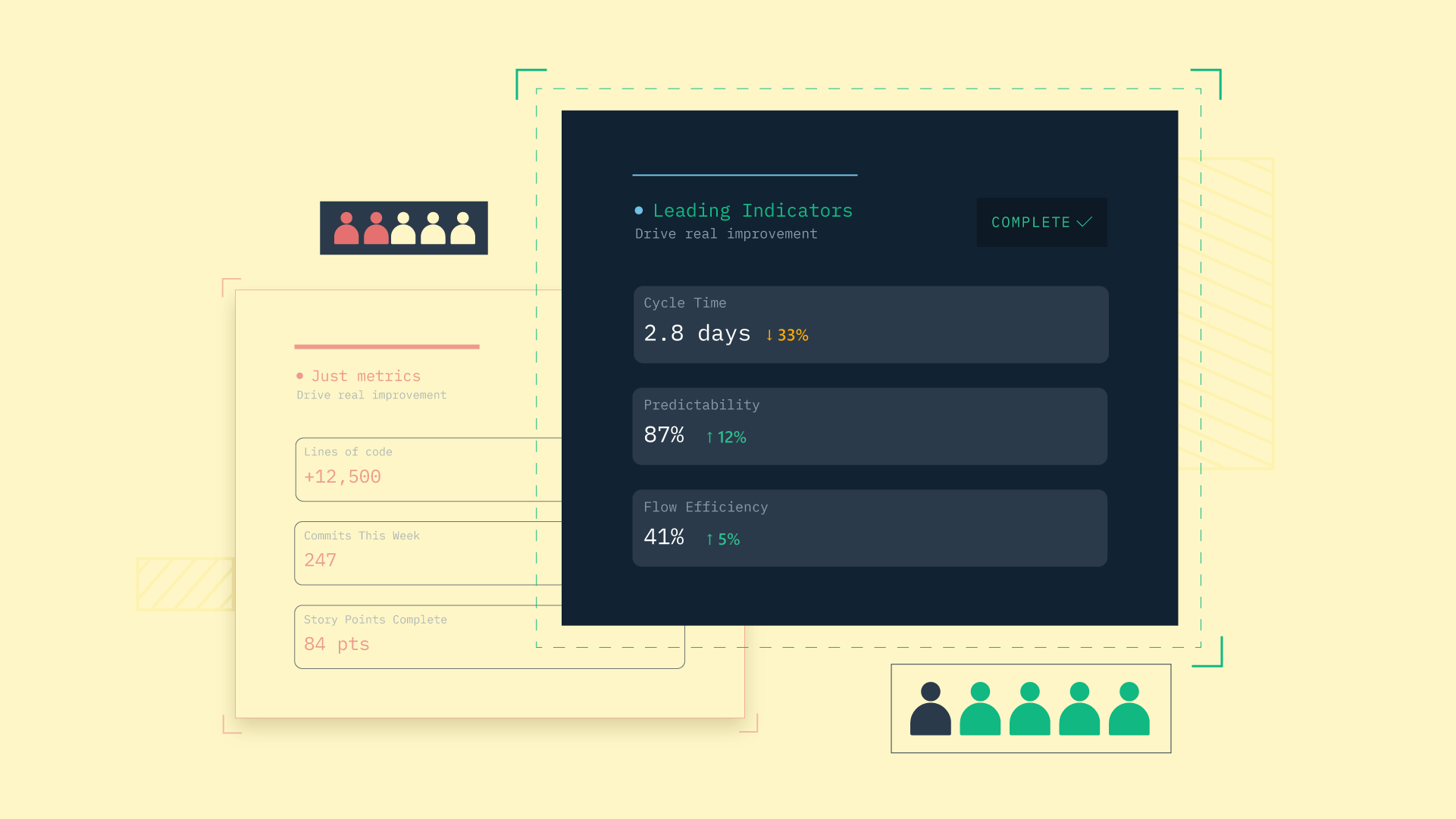
 Your team runs a clean sprint, the burndown looks textbook, and velocity is up two points. None of that answers the question your VP actually asked: are we getting better?
Most agile metrics were built to describe what happened inside one iteration. "Are we improving" is a different question entirely, one about trends and baselines, and the canonical agile dashboards mostly cannot answer it.
So here is what comes next: what agile metrics measure, why the popular ones describe activity rather than improvement, and the small set of flow and quality metrics that actually prove a team is getting better over time.
Agile metrics: Key takeaways
- Agile metrics do two different jobs: signalling what happened in an iteration, and signalling whether the system is improving over time, and most teams only track the first.
- KPIs are the small subset of metrics a team has chosen to act on, so calling every number a KPI is why dashboards drown in data nobody uses.
- Improvement shows up only in trends read against a baseline, with a flow metric and a quality metric together, never in a single sprint's snapshot.
- Every agile metric belongs at the team and process level, since using them to rank individuals breaks both trust and the data.
What are agile metrics and what do they actually measure?
Agile metrics are the numbers a team collects to understand its delivery, and they quietly split into two jobs.
The first job is signalling what happened inside an iteration, like whether the sprint hit its commitment. The second job is signalling whether the system is improving over time, which is a question about the trend across many iterations rather than any single one.
Most teams collect the first kind thoroughly and treat the second as a vibe check. Agile project management metrics like burndown and velocity get reviewed every sprint, while "are we actually getting better" gets answered from memory and gut feel in a quarterly review. That gap is the wedge worth working on.
The fix is learning to tell the two kinds apart, then building a small dashboard around the handful that track improvement. That is the work ahead, starting with the distinction that makes the whole thing legible.
Agile KPIs vs agile metrics: the distinction that changes everything
A metric describes what is happening. An agile KPI is the small subset of metrics a team has deliberately chosen to evaluate success and drive its next change. Every KPI is a metric; very few metrics deserve to be KPIs.
The trouble is that most teams call everything a KPI. The dashboard collects velocity, burndown, story point accuracy, commit counts, and a dozen more, all flagged as key, none of them actually driving a decision. A number is only a KPI if its movement would change what the team does next, and most numbers on a typical agile dashboard fail that test.
This is why dashboards drown. When everything is a KPI, nothing is, and the team learns to ignore the whole screen. Picking the few metrics that genuinely change decisions is the entire skill, and the sections below are about which ones earn that status.
The five agile metrics most teams already track
These five are the canonical agile software development metrics, the ones every team knows. They are worth understanding well, because each does a real job inside an iteration.
- Sprint burndown tracks work remaining against an ideal line.
- Velocity tracks story points completed per sprint.
- Epic and release burndown tracks progress against a larger body of work.
- Cycle time tracks how long each issue takes from start to done.
- Cumulative flow tracks how many issues sit in each workflow state over time.
Walk through what each one shows, and a pattern appears by the end. Every one of these answers "how did this sprint go," and only one of them comes close to answering "is the team getting better."
Sprint burndown
A sprint burndown shows the work remaining in a sprint plotted against an ideal line that falls to zero on the last day. It is good at spotting scope changes mid-sprint and surfacing work that was never sized properly, since both show up as the actual line diverging from the ideal.
What it does poorly is improvement. A clean burndown this sprint tells you nothing about whether next sprint will land, because it is a snapshot of one iteration with no memory of the last ten. The sprints view in an engineering dashboard can hold this history across cycles, but the burndown shape alone cannot.
Velocity
Velocity is the average story points, or task count, a team completes per sprint over a rolling window. It has a real use: rough capacity planning when the team's estimation is stable and nobody is treating the number as a target.
What it does poorly is cross-team comparison and improvement tracking. Story points are not a unit, so comparing two teams' velocity is meaningless, and velocity inflates the moment anyone makes it a goal, because estimates quietly grow to meet it. It is the easiest agile metric to game and the worst one to compare across teams, which is worth saying plainly even though it remains useful for planning.
Epic and release burndown
An epic or release burndown shows progress against a larger body of work than a single sprint, accounting for scope changes inside that epic or release. It is good at forecasting a release date and at exposing scope creep that single-sprint metrics hide, since added scope is visible as the total moving.
What it does poorly is telling you why the line moves the way it does. The burndown looks identical whether the team got faster, the scope got smaller, or both happened at once, so it raises questions it cannot answer.
Cycle time
Cycle time shows how long each issue takes from in-progress to done, plotted over time on a control chart. This is the first metric on the canonical list that can actually show improvement, because the trend is the point, not the single-sprint snapshot.
It is also where a fuller treatment pays off. DevStats breaks PR cycle time into five stages of coding, pickup, review, merge, and deploy, which turns a single number into a map of where time goes. We go deep on why cycle time is the most important metric in software development, and on what belongs in a cycle time report, and the improvement section below builds on both.
Cumulative flow diagram
A cumulative flow diagram stacks the number of issues in each workflow state over time. It is good at making bottlenecks visible: if the "in review" band keeps widening, the team has a review problem no matter how healthy velocity looks. Kanban University's flow guidance is a clean reference for how cumulative flow, work in progress, and throughput fit together.
What it does poorly is replace a real investigation. The chart shows the symptom, a band that keeps growing, and not the cause, so it points you at the bottleneck without explaining why work is stuck there.
Why these metrics tell you what happened, not whether you got better
Every one of the canonical five gives you a snapshot of an iteration, and "are we improving" is a question about a trend, a baseline, and a counterweight. A single sprint's burndown or velocity simply has no way to express getting better, because improvement only exists across time.
Two examples make the trap concrete. Velocity climbing while change failure rate climbs alongside it is not improvement, it is the team shipping more bugs faster. A burndown that lands perfectly every sprint can describe a team that has quietly lowered its commitment to guarantee the clean line, which looks like discipline and reads like stagnation.
The pattern is the same each time. Activity metrics answer "what happened this sprint," and improvement is a question they were never built to answer. The next section covers the metrics that were.
The agile metrics that actually prove improvement
To know if a team is improving, measure flow and quality together, as a trend, against a baseline. No single one of these tells the whole story alone, and the comparison that matters runs over months rather than weeks, since a two-week window mostly measures noise.
These are the agile metrics examples worth putting on a real dashboard:
| Metric | What it reveals | What improvement looks like |
|---|---|---|
| Cycle time trend | How long work takes from start to done, over months | Falling median, with the pickup or review stage tightening |
| Throughput trend | How much the team completes per week or sprint | Rising or stable, without ticket size shrinking to fake it |
| Change failure rate | The share of deployments that cause an incident or rollback | Falling or flat while speed rises |
| Planning accuracy | The share of committed work that actually ships | Rising toward a realistic, sustainable level |
| Unplanned work ratio | Work added mid-sprint versus work committed | Falling, as upstream chaos gets brought under control |
Cycle time trend
The improvement signal is not a single sprint's average, it is the rolling median over months, ideally broken out by stage. A team that genuinely improves shows cycle time falling and a specific stage, usually pickup or review, tightening up where the slack used to hide.
This is the metric to anchor a dashboard on. A staged view of PR cycle time read over a quarter is the clearest single answer to "are we getting better," which is why we treat cycle time as the most important metric a delivery team can watch.
Throughput trend
Throughput is PRs merged or issues closed per week or sprint, charted over time. It is the honest version of velocity: it does not depend on estimation, it does not inflate when story points get bigger, and it can be benchmarked against the team's own baseline rather than another team's.
Read it carefully, though. Throughput is only meaningful alongside cycle time and quality, because on its own it rewards smaller, more numerous tickets, and a team can lift throughput simply by slicing work thinner without shipping any more value.
Change failure rate
Change failure rate is the quality counterweight that stops a team from gaming the flow metrics. Define it cleanly as the percentage of deployments that cause an incident, rollback, or hotfix, and pair it with cycle time so speed never gets read in isolation.
That pairing is what separates "we are shipping faster" from "we are shipping faster and breaking more." DORA metrics formalize this flow-and-quality balance, drawing on Google's DORA research, and our explainer on what the DORA metrics are covers how change failure rate sits alongside the other three.
Planning accuracy
Planning accuracy is the percentage of committed sprint work that actually ships, tracked over a rolling window. A team that improves here is getting better at sizing work and protecting focus, not better at over-committing and hoping.
Read it as a calibration signal rather than a target. Planning accuracy climbing toward a realistic level alongside a stable sprints view means the team's forecasts are becoming trustworthy, which is its own kind of improvement.
Unplanned work and scope creep
Unplanned work is the ratio of work added mid-sprint or mid-epic to the work that was committed. High unplanned work usually signals something upstream bleeding into delivery: incidents, customer escalations, or product changing the brief after planning, and there are real tactics for handling unplanned work before it derails a sprint.
Trending scope creep down is one of the highest-leverage improvements a team can make. Once it falls, it shows up in every other metric, because a team that controls its inputs can finally improve its flow.
How to build an agile metrics dashboard that drives improvement
An agile metrics dashboard works when it is short and opinionated, not when it is exhaustive. The aim is a screen the team actually reviews, where every metric on it has earned its place. Five rules get you there:
- Pick four or five metrics, no more. A dashboard that fits on one screen gets read; one that scrolls gets ignored.
- Mix flow and quality. Pair at least one speed metric with one quality metric, so the dashboard cannot reward shipping faster and breaking more.
- Set a baseline. Every metric needs a reference point, because "good" only means something against last quarter or a benchmark.
- Review them in retros. Put the dashboard in the retrospective and ask what each number drove, since metrics nobody discusses are metrics nobody acts on.
- Kill anything that doesn't change a decision. If a metric moving would not change what the team does, cut it and reclaim the attention.
The hard part is the cutting, not the collecting. Most teams already have more data than they use, so building a useful dashboard is mostly an act of subtraction, and the dashboard becomes one of the engines of continuous improvement once the team reviews it honestly each cycle.
Avoiding the surveillance trap: metrics for agile teams, not individuals
Every agile metric here belongs at the team and process level, not the individual one. Using cycle time to rank developers will kill trust and break the data, because people optimize for the number the moment it appears on their review.
The reasoning behind this is well established. The SPACE framework, which informs how modern teams think about developer productivity, makes the case that productivity is multidimensional and cannot be captured by any single individual metric, which is exactly why metrics for agile teams should describe the system rather than score the people in it. A widening review queue is a process problem to solve together, not a stick to measure one engineer with.
The practical rule is simple. Aggregate every metric to the team, read it as a signal about the workflow, and use it to ask better questions in the retro. The moment a metric becomes a leaderboard, it stops telling you the truth.
How DevStats turns agile metrics into a picture of improvement
Assembling flow, quality, and planning trends by hand across several tools is possible, and it is most of a full-time job.
DevStats is an engineering intelligence platform that connects to GitHub, Jira, Linear, and the rest of the delivery stack and surfaces those metrics in one place, with benchmarks and trends so the improvement question has an actual answer.
That means cycle time broken out by stage, throughput against the team's own baseline, change failure rate beside delivery speed, and planning accuracy over a rolling window, all benchmarked against 1,000+ teams. The metrics that matter for improvement live together instead of scattered across five dashboards that never get cross-read.
The framing stays diagnostic. DevStats shows you that cycle time fell but unplanned work crept up; you read it with your knowledge of the team and decide what changes. Everything is measured at the team and process level, never as individual rankings, which keeps the data honest and the surveillance trap closed.
See whether your team is actually improving
The improvement question deserves a real answer, not a quarterly guess.
Connect your existing tools and DevStats shows your flow, quality, and planning trends against a baseline in under 2 minutes with no code changes. See pricing and find out whether the last few quarters actually made your team better.
Frequently asked questions
What are the most important agile metrics to track?
Track a small mix of flow and quality metrics over time: cycle time trend, throughput trend, change failure rate, and planning accuracy. Read together against a baseline, they show whether the team is genuinely improving, which single-sprint metrics like burndown and velocity cannot. Keep the set to four or five so the dashboard stays actionable.
What is the difference between agile metrics and agile KPIs?
A metric is any number that describes what is happening, while a KPI is the small subset a team has chosen to evaluate success and drive change. Every KPI is a metric, but a metric only becomes a KPI if its movement would change what the team does next. Calling everything a KPI is why most dashboards collect numbers nobody acts on.
Should agile metrics be tracked per developer or per team?
Track them at the team and process level. Individual tracking, like ranking developers by cycle time or commits, destroys trust and corrupts the data as people optimize for the metric. Agile metrics are meant to surface process problems the team solves together, not to score individuals.
How long does it take to see whether an agile team is improving?
Expect months rather than weeks, since improvement is a trend that needs several iterations to separate from normal variation. A two-week window mostly shows noise, while a quarter-over-quarter comparison against a baseline reveals the real direction. Flow metrics like cycle time move slowly, so patience is part of measuring them honestly.